Responsive Fix & Mobile Optimization
Is your website breaking on mobile devices? Let’s fix that.
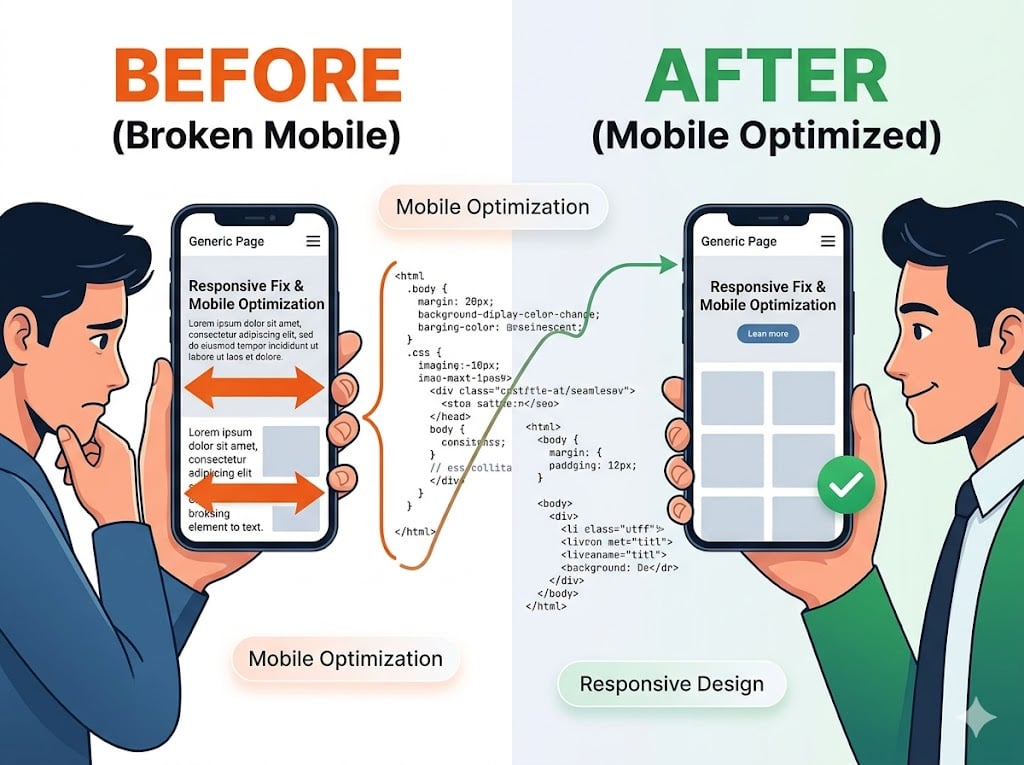
A site that doesn't work on mobile isn't just annoying—it’s costing you customers and SEO rankings. I will audit your existing site and write custom CSS to ensure it looks and functions perfectly across all screen sizes, from ultra-wide monitors to the smallest smartphones.
What I will do:
- Layout Correction: Fix overlapping elements, broken grids, and "sideways scrolling" issues.
- Mobile-First UX: Optimize navigation menus, buttons, and forms for touch-screen users.
- Cross-Browser Testing: Ensure consistency across Safari, Chrome, and Firefox.
- Speed Check: Minor tweaks to ensure responsive elements don't slow down your load times.
The result: A seamless, professional experience for every visitor, no matter what device they use.